Flat Illustration Trees and Leaves
In a continuation of a banner that will have houses, trees, clouds and some text, I started working on trees. The one above is the one I like best, although I realized that I should get the tree trunk to be straighter if I want to use something similar in my banner. There are many details to construct, and getting everything to work together and not be too busy will be an interesting challenge.
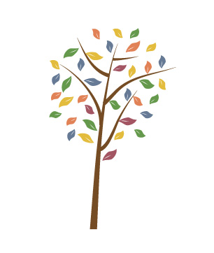
This was my first set of “flat illustration trees.” These trees are made up of triangles and circles. One version of this had a grunge look added at the end (using Photoshop – the shapes where created in Illustrator). If you examine illustrations of flat design, you will often see trees depicted in a similar manner of only these basic shapes.
What makes an illustration “flat design”? How does it differ from other art? It’s missing the shadows. And it’s made up of simple shapes. It’s often vector art, so it can be made bigger or smaller without losing its look, unlike a photograph with pixels.
If you are interested in making tree illustrations yourself, check out my Pinterest board of Illustrator and Photoshop Tutorials.
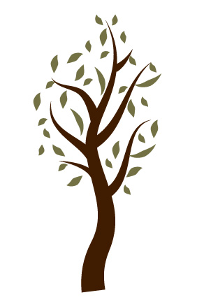
Both these two illustrations use the same twirly tree trunk. The bends of the tree trunk add a certain look that might go well with a different illustration – I think I will go with a straighter trunk, as the houses are quite straight as well. On the other hand, maybe a twisty trunk would be welcome next to a stiff, geometric house.
Of these illustrations, do you have a favorite? Any parts that you like in particular? Have you noticed flat design on any sites that you visit?
Lorri M. says
I really like the variety you present us! Nice work on these illustrations.
My favorite is the first one, with the slightly twisty trunk, and color combinations that compliment and contrast each other. I, personally, would keep the trunk the way it is, giving it a more natural look. Not all tree trunks are straight. And, it would also be a bit of a variance from the more geometrical house.
Leora says
Thank you so much for the feedback, Lorri! Maybe if I have a matching tree that is horizontally flipped from this one, it will be an interesting composition. My next "issue" is that the houses I have already created are quite detailed - reducing some of that detail is a task I am suspecting will be challenging.
Lorri M. says
That sounds like a good idea...as no two trees are, in reality, alike.
You always display wonderful details in your work. I hate to think of you reducing some of it, but totally understand the necessity of it.
Leora says
Well, I am anticipating a problem in advance, so maybe it won't be as bad as I think. If I never try, I certainly won't succeed.
Thanks for your continued interest and enthusiasm, Lorri. It really helps.
Lorri M. says
Good thinking on your part! That's what I like to hear...the fact you are trying and will try!
Ramblingwoods says
I like them all...not very helpful I know....
Leora says
Michelle, of course that's helpful! Glad you like them.
Debra Yearwood says
I like the first tree best, but I have a bias for fall trees so the others didn't stand much of a chance. :)
Leora says
Debra, thanks for visiting. Well, that's nice feedback - by the time I get the trees into a mural, it may be close to fall, and the colors will liven up the page. I'll keep that in mind.
Jeri says
I like the first one because it's the most colorful, but the last two because the shape of the tree trunk is more bold and shapely.
Leora says
Thanks, Jeri! I could easily create a tree with the trunk of the last two and the leaves of the first. Appreciate the feedback.
- Leora
Hannah says
My favorite is the top one because of the colors. I had no idea what flat illustrations were. Thanks for enlightening me.
Leora says
I think the real term is "flat design," but if you pay attention to online graphics, you will probably say, aha, there's yet another example.
Jacqueline Gum (Jacquie) says
I too liked the first one. I think the colors are more interesting and I like the slightly curved trunk and branches. Which I think might present a nice contrast to what you say are your geometric houses :)But mostlky I'm drawn by the diversity of colors
Leora says
I also enjoy the unexpected colors of the first!
Paul Graham says
Hi Laura. I think you have a special talent for flat illustration. My personal favourite is the grunge look due to its simplicity and the fact that the composition is brilliant. If the first one were a 'standalone' or on the left side of the banner I would leave the trunk leaning left right to lead the eye to the next element. It all depends on the placement.
Leora says
Paul, I'm glad you say I have a talent for this, as I enjoy doing the illustrations just to do the illustrations (art for art sake?), so whatever composite result I get in the end is fine with me.
Jacqueline Gum (Jacquie) says
I too liked the first one. I think the colors are more interesting and I like the slightly curved trunk and branches. Which I think might present a nice contrast to what you say are your geometric houses :)But mostly I'm drawn by the diversity of colors
Catarina says
Also like the first one best. Not sure what you are going to use the drawings for but one thing that it may benefit you to take into account is that the drawings look exactly like most drawings you see online. It may hence be a good idea to use another teqnique or design to differentiate yourself from everybody else? Just a thought:-)
Leora says
Catarina, I wrote earlier how I am creating a banner of houses, and the trees will go in between. If it comes out well, it will be a banner for my home page.
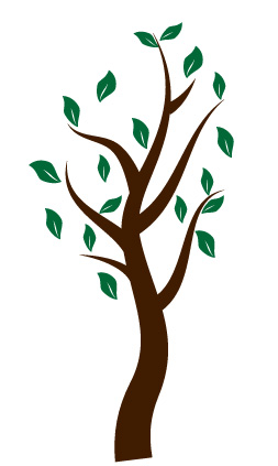
A.K.ANdrew says
Great illustrations Leora - I like the last tree best because I think it captures the freedom of the leaves. And the color too I like. I have mixed feelings about vector art - partly because I haven't played with it as much as other online forms such as apps like Brushes, Artrage etc. And also because I'm a painter not an illustrator. But I do miss the shadow aspect. Thanks for sharing these with us.
Leora says
Funny, about missing the shadows! I find this flat art rather freeing. There's a kid side of me that comes out and says, I don't have to work on form, just shape and color!
Lenie says
Hi Leora
The first one is the most eye-catching but the last one is the one I like best - I like the trunk of it.
Good luck - I think you'll do just fine.
Lenie
Leora says
Lenie, glad you like that twisty trunk! Thanks for leaving a note.
Tim says
The last one for me to. I fear is I am boring and don't like color but that's far from true. Something simple and appealing about the last one. Btw, they all are quite cool and I think I will look into how to do these myself.
Leora says
Tim, well, if your gut says you like the last one, that's fine with me. I enjoyed creating them. I'm glad you might make a few yourself - it's fun.
William Butler says
Hi Leora,
I love all sorts of creativity. Thank you for sharing these with us.
I like the third tree the best because the shape stands out better against the dark green and I like the way you've included the white in the center.
Kind Regards,
Bill
Leora says
Bill, thanks for your comments. I appreciate your notes on the trees.
Laura says
I guess I am alone in this, but my favorite, especially to go with the house, is the third from the top. I think the multi-colored one will look too busy with the houses. I like how the swirl of the trunk of the third from the top contrasts with the straight lines of the houses. (I actually cut and pasted the images into a word document to see how they look side by side).
Leora says
"pasted the images" - wow, you are way ahead of me. I'm enjoying the process, and I started the banner with just two houses and some sky.
The end resulting banner may indeed be a limited palette, though the leaves may be blue instead of green and much else might be browns and tans. Then maybe to that I'll throw in some unexpected light raspberry color.
Donna Janke says
I like the illustrations with the twisty trunk the best, at least as a stand-alone. I don't know if it is the one that will work the best with the rest of your banner.
Leora says
Donna, I appreciate your opinion! Who knows, maybe the trees I choose will somewhat different than any of these. I enjoy the process of creating and sharing.
Ilaria says
Cool drawings Leora! Personally, I like very much the second one because of its stylized design and the 3rd one for its green shade of colour :)
Leora says
Wow, I think you are the first to like the second one. To me, it looks just like the trees in the tutorial from whence it came, so not terribly original. The third one does have a nice green! I'll keep that shade in mind when I'm making leaf choices.
Erica says
Hi Leora! You know, I was completely sold on the first tree. Its bright colors just make me happy. Then I realized I could click and see the house. That made me re-examine the options. I actually like the last one for next to the house. I think a windy tree sits next to a straight house. I liked the more muted leaves of the last one since the house is already green.
Leora says
I like how you looked at the house to decide on the tree. Truth is, the plan is for three houses, and I haven't decided how many trees. But this post got me started with tree designs.
Susan Cooper says
Gosh, I thought I had commented on this... oh well. I love these flat illustrations the first tree is my favorite. I think it's the many colors and the feeling of movement it presents. I also think it offers a great foil around or against images of buildings. Just my thoughts. :-)
Leora says
Susan, I like that you mention color and movement. Yes, those are nice features next to a stiff building.
Carl says
These are lovely illustrations. Thank you for sharing them. I love the second one the most, to be honest. It's great that you take such simple shapes as circles and triangles and made them into something so cool and lively. Hopefully I'll get to see more of your stuff in the future.
Leora says
Carl, thank you for leaving a note.
Hopefully, I will have time soon the future to do more - I do these in between work projects, and I now have a new work project that I need to finish soon.
Tuhin says
The third one is the best according to me. The reason for this is the design of the leaves. Looks attractive! Good work Leora!
Lisa says
I like the third one best as well, I think it is the way the curves of the trunk and the colors work together. But I have to admit I really like the second one as well, it reminds me of an illustration from a children's book.
Please leave a comment! I love to hear from you.