Raritan River Watercolor: Boy and Fisherman
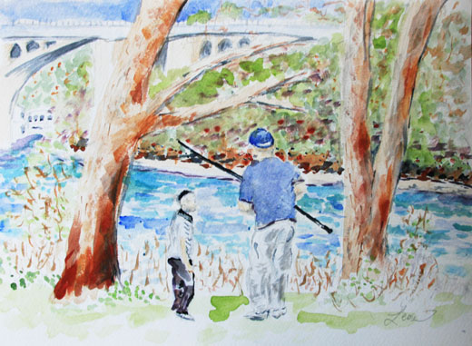
I finished this watercolor painting of a boy talking to a man fishing at the Raritan River two weeks ago at the same time I completed the Highland Park Traffic watercolor. This watercolor belongs to a series of art projects that I have done on this theme. I’m going to replicate some older art river/fisherman projects on this post (so you don’t have to click back to look).
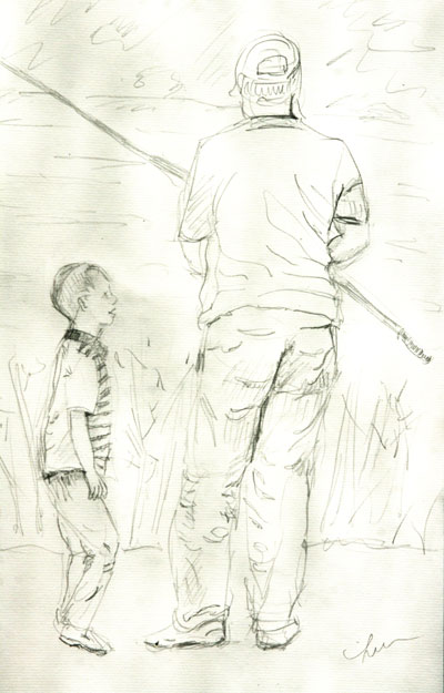
Here’s the drawing of the boy and man:
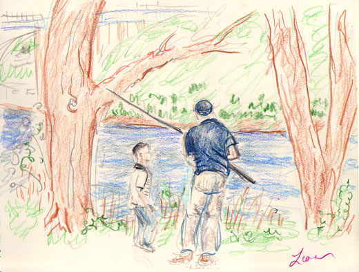
And here’s a colored pencil sketch of the scene:
Finally, this is a Raritan River watercolor I did last summer, of a similar scene by the Raritan River:

I have some ideas for a next watercolor: maybe a combination of an Israeli flag with jacaranda blooms, mabye an illustration of a therapists since I am working on websites for therapists, maybe another Highland Park scene – we shall see.
Hannah says
Do you prefer the last one over the others? Haven't you slightly altered the man's position between the drawing and the other two? They're all great in their own ways.
Leora says
No, I can't say I prefer any of these (though the colored pencil sketch is my least favorite).
Doing people in watercolor is hard. I prefer the drawing of the boy in the pencil drawing to how he came out in the watercolor. That's one reason I may switch (back) to oils at some point. In oils, one has more control. But oils take a lot of set up and more time.
Thanks for leaving a comment, Hannah.
Ramblingwoods says
Oh no therapists... Lol.... My daughter wanted to see some of my photos for her site..... I always enjoy your art... Michelle
Leora says
I'm thinking a butterfly theme would work nicely for her site ... sort of like, set a person free ... but that's up to her.
Jewaicious says
I love how you walked us through your work. I like the last one. Benches speak to me for some reason.
Jewaicious says
I love how you walked us through your work. I like the last one. Benches speak to me for some reason. So do chairs.
Leora says
Somewhere I have a photo of a bench by the Raritan River. I seem to return to this area of Donaldson Park every few months. I'll pay more attention on my next expedition.
Jill says
I like the way the Raritan River looks like a beautiful Caribbean blue. Artistic license is a wonderful thing.
Leora says
I didn't really feel like I needed to stick to realistic colors. I enjoyed painting the trees various rusty reds and sap greens.
Please leave a comment! I love to hear from you.